
project overview
roles
timeline
tools
Ux Research
Wireframing
Prototyping
Usability Testing
80 hours
Figma
Maze
impact
5/5
participants fully engaged with Agenda View, demonstrating that this feature transforms into a clear, actionable workflow -- solving the frustration of Pinterest boards feeling too general
5.43
seconds on average were spent per step, showing that participants completed tasks efficiently and that the Planner View streamlines the planning workflow
"I can organize my thoughts and see everything in front of me"
"This makes me excited to plan!"
problem
Pinterest has always been my go-to place for inspiration, but I've consistently faced the same challenge: saving ideas without a clear way to act on them. This gap highlights a larger problem - Pinterest lacks tools for users to translate inspiration into tangible plans for their everyday lives or special events.
& yes, they already have tools like Boards and Sections, but there is a gap between inspiration discovery and actionable, structured planning. Pinterest partially meets the need but I want to bridge the gap between inspiration mode and execution mode.
solution
I developed a product that shows the visualization of a plan, not just a folder of pins.
01 background
Pinterest is a social platform where users can search, save, and shop for inspiration for anything and everything. It is often described as a "digital bulletin board" where users can organize their pins, get inspiration, and share their creations.
research goals
We want to know how users plan and organize their content, and uncover ways to make this process more structured and visually intuitive.
research objectives
Identify how users currently organize and plan content for trips, events, and projects
Evaluate the limitations of Pinterest's current features for organization in boards, sections, etc.
Determine what the end goal for the user looks like - ex: seeing outfits come together, planning by day, etc.
02 discover
I created a feature analysis to compare organization and planning tools with other platforms and how they help users move inspiration to execution
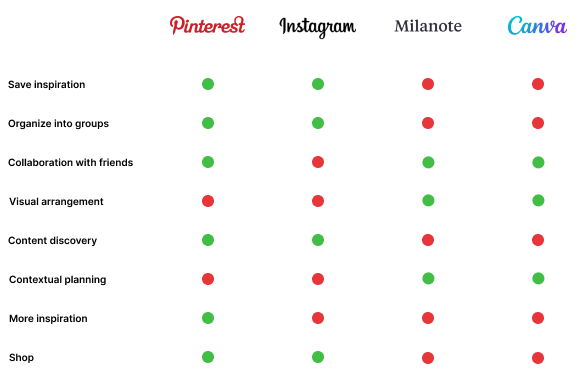
Pinterest's core identity has always been inspiration first but falls short in helping users organizing those ideas into daily life. This created an opportunity for the platform to go beyond just discovering ideas and into contextual planning.
user research
"Idea vomit" of pins can be overwhelming
I conducted interviews with 5 participants and discovered three main pain points with Pinterest.
key takeaways
60%
of users create multiple boards for a trip or event, and the remaining 40% combine all pins together in one category
40%
of users resort to external tools like excel or docs to sequence or visualize ideas
60%
of users feel like they can only get a general "vibe" of the board rather than a clear sense of how to execute the ideas
03 define
Users take too much time deciding which pins to draw inspiration from and organizing them into actionable plans.
While Pinterest provides curated inspiration, users take too long translating boards into actionable ideas because there is no clear way to organize pins by day, activity, or project.
pov & hmw
I came up with two pov and hmw statements to explore how Pinterest could better support users moving from inspiration to action.
POV #1
As a visual planner, I want to see my inspiration in a structured way so I can move seamlessly from collecting ideas to executing plans.
How might we...
Bridge the gap between inspiration browsing and structured planning within one platform.
POV #2
As a content creator, I want to connect my outfit plans with my content ideas so I can streamline filming and posting.
How might we...
Bring outfit inspiration and content planning into one platform to reduce the need for switching between tools.
user persona
I wanted to step into the user's mindset, so I created two user personas based on needs, emotions, and behaviors, not just assumptions.


With these personas, I can understand where the user is coming from and define my design decisions.
journey map
I created a journey map of the current Pinterest flow using my user persona to identify where challenges emerge throughout their process.

By mapping my user's workflow on Pinterest, I was able to see where inspiration stops and frustration begins -- revealing clear opportunities for a supportive planning experience.
user & task flows
To visualize how users navigate the new feature, I created user and task flows that outline each step.

These flows demonstrate how users transition from gathering inspiration to taking action, ensuring each step supports a clear and intuitive path toward their goals.
04 develop
I created wireframes to bring the user flows to life, illustrating how each step translates into an intuitive and cohesive experience.
low-fidelity
wireframes
To start visualizing the user flows, I drew low-fidelity wireframes to get the big picture of what I wanted the feature to look like.

I also came up with a "Add a moodboard feature" for users wanting to dump their ideas.

mid-fidelity
wireframes
I moved onto mid-fidelity wireframes to translate the user flows into a more detailed, functional representation.

high-fidelity
wireframes
Once the layout and flow were finalized, I transitioned to high-fidelity wireframes to integrate visual identity elements and refine the overall design.

usability testing
I conducted a usability test with 5 participants to validate user flows and ensure the design is aligned with user expectations.
With the results from one of the screens, I found out that some participants were able to directly find the correct flow while others had some trouble.


The usability score of the 2 screens above were calculated at 61.Looking at the results and the mission I gave the participants, I am wondering if I worded the mission too specifically, leading them in a different direction.

I received design feedback from one of my participants suggesting I should create drop downs instead of cards for each day.
"I wonder if it would be neat to have the to-do lists be shown not only as large tiles but also as a top-down list with line items that are more condensed. I'm just thinking of how I organize my files on my laptop (mac) by icon/list depending on how it's easiest to distinguish files from each other."
The current view supports visual organization, a list view could provide more flexibility for users who prefer a more compact structure which is something to consider for future iterations.
key takeaways
5/5
participants fully engaged with Agenda View, demonstrating that this feature transforms into a clear, actionable workflow -- solving the frustration of Pinterest boards feeling too general
5.43
seconds on average were spent per step, showing that participants completed tasks efficiently and that the Planner View streamlines the planning workflow
final prototype
I finalized my prototype to capture the full journey - from inspiration to execution - and illustrate how users can seamingly plan within Pinterest
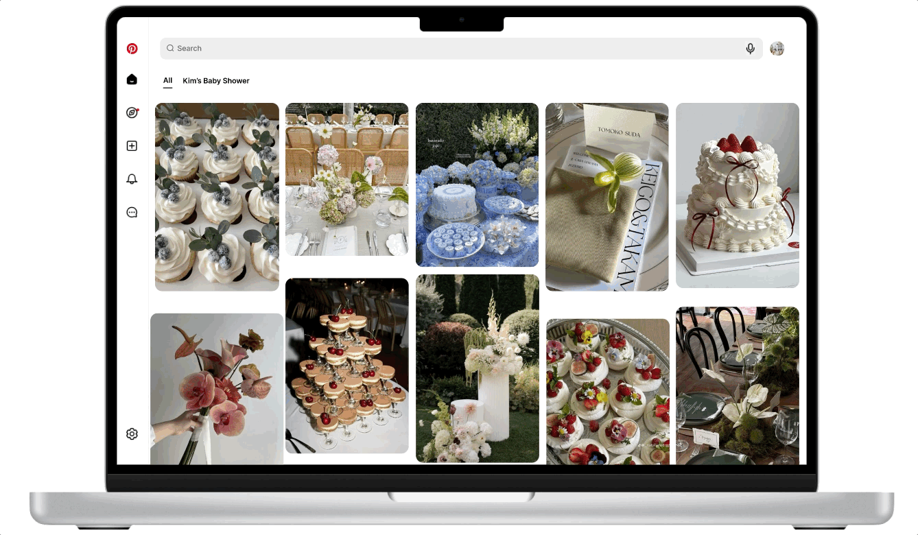
Create bridal shower inspiration in "Planner View"
next steps
Conduct further usability testing
Test variations of layout options (ex: list view vs tile view) based on user feedback.